
I receive a lot of email through the course of a day – enough that I’ve started to employ some simple automation when responding. Despite now approaching the sixth decade since email was created, there are still some things about the world’s most ubiquitous online communication system that are broken. And the one that most gets on my nerves is formatting. Like many people, I switch between my smartphone, tablet and computer through the day. And the number of emails I receive that aren’t readable on one of the screens is ridiculous. But there are some simple things you can do to ensure your message makes it past the delete key.

Keep it simple
One of the things modern email software lets you do is add formatting to your messages. You can change the font and colours, apply paragraph formatting and apply all sorts of fancy effects.
But if you want to ensure your messages can be read on the widest possible array of devices and screen sizes – keep it simple. Avoid using fancy fonts or ‘clever’ formatting. Not every email applications will display the text the same way.
One of the main culprits for text that scrolls past the edge of a screen is composing messages in a word processing app and then copy/pasting it into your email client. If you do that, use ‘Paste Special’ so only the text, and none of the formatting that is automatically applied by the word processing software, makes it into your email.
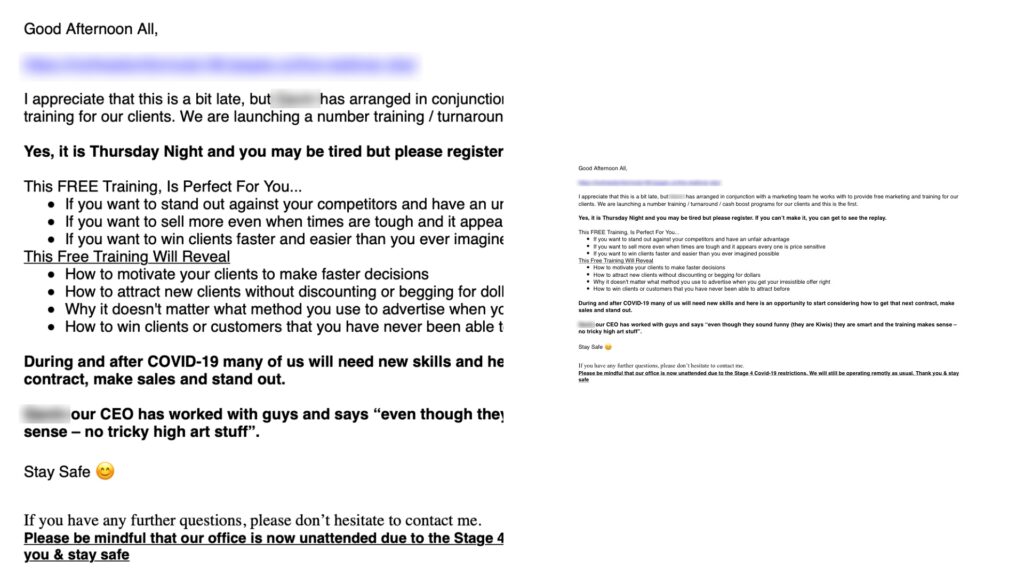
Look at this. it’s the same message on my computer (left) and on my phone (right). The version on my phone is unreadable as the typeface is so tiny.
I received an email the other day with pale grey text on a black background. It was unreadable. And don’t get me started on crazy fonts!

Your email client will have an option for sending email as plain text. Use it!
Test before sending
Have you ever checked an important email before sending? I assume you proofread, looking for grammatical and spelling errors, but do you check how it will look on different devices?
There are times when you want to inject some formatting into a message. For example, if you’re sending a press release or important corporate message you may need to include logos or make particular names bold or add emphasis. So, the ‘Keep it simple’ advice that ensures maximum compatibility isn’t an option.
Before sending that message, send it to yourself (creating email account using a free email service for testing is handy for this) and check it on different devices. I’d suggest testing on a smartphone, tablet, computer and through a web browser as well as email software such as Windows Mail, Outlook or Apple Mail.
Consider using an email service for mass messaging
If all that sounds hard then consider using a Customer Relationship Management system such as HubSpot (which has a very generous free tier) or email service such as MailChimp.
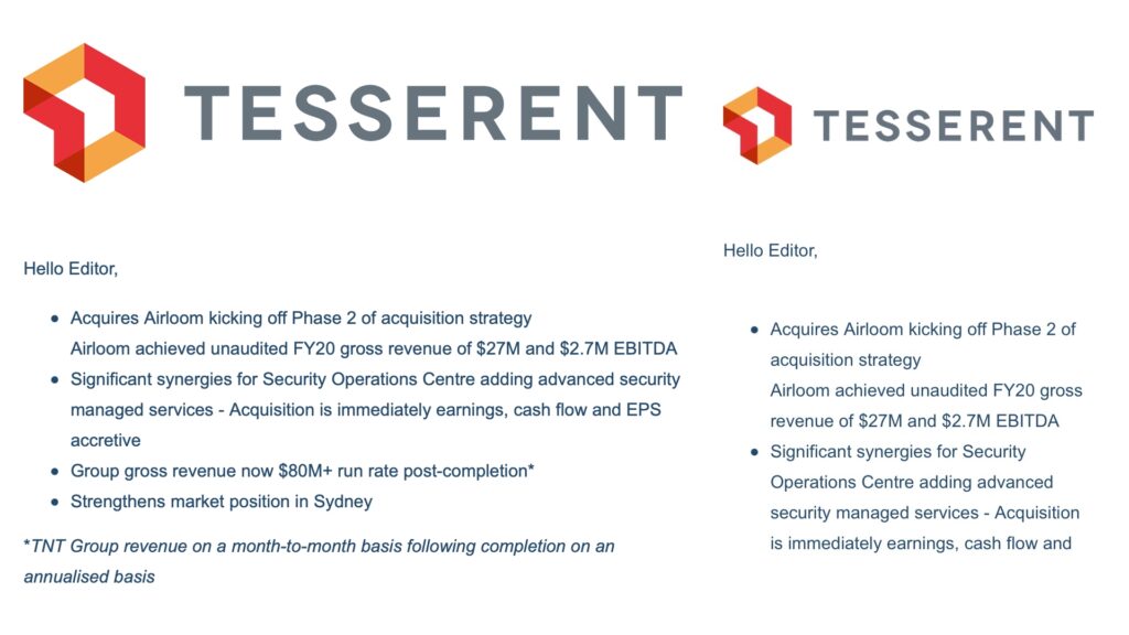
Tools like these allow you to create mail-outs with formatting, images and other fancy features that will render correctly on displays of any size. Look at this example. The email was produced in HubSpot. On the left, we see what it looks like on a PC while the right side is the same message on a smartphone.
When you send an email, the focus should be purely on what you want to say. Remember to consider the reader and ensure they will be able to easily read your message no matter where they are on whatever device they have at hand.